" width="66px"><path d="M 0 39.6 L 0 0 L 66 0 L 66 39.6 Z" fill="transparent" height="39.599999999999994px" id="XvfzCwFws" width="66px"/><path d="M 2.507 3.165 L 1.824 12.696 C 1.72 14.136 1.53 15.576 1.548 17.016 C 1.566 18.37 1.943 19.737 3.039 20.616 C 4.997 22.174 7.806 21.307 9.588 19.896 C 11.485 18.364 12.865 16.284 13.54 13.938 C 14.898 9.32 13.288 3.388 8.478 1.516 C 7.452 1.131 6.346 1.01 5.262 1.162 C 4.177 1.314 3.147 1.735 2.266 2.387 C 1.274 3.1 0.551 4.127 0.213 5.303 C -0.125 6.478 -0.059 7.734 0.402 8.866 C 1.436 11.462 3.775 12.999 6.229 14.1 C 8.848 15.274 11.65 16.228 14.56 16.17 C 17.118 16.12 19.744 15.241 21.602 13.431 C 22.586 12.473 23.427 10.99 22.234 9.831 C 21.748 9.387 21.108 9.15 20.45 9.173 C 19.793 9.196 19.171 9.476 18.717 9.954 C 17.786 10.864 17.237 12.315 16.816 13.521 C 16.327 14.844 16.21 16.276 16.479 17.66 C 16.746 18.933 17.484 20.057 18.546 20.806 C 19.607 21.555 20.912 21.873 22.198 21.696 C 24.903 21.386 27.019 19.467 28.686 17.448 C 29.56 16.4 30.338 15.274 31.011 14.086 C 31.729 12.808 32.509 11.149 31.331 9.874 C 30.468 8.942 28.931 8.895 27.903 9.565 C 26.761 10.313 26.179 11.692 25.794 12.952 C 25.004 15.565 25.471 18.766 28.076 20.169 C 28.64 20.486 29.272 20.665 29.918 20.692 C 30.565 20.719 31.209 20.593 31.798 20.324 C 32.987 19.781 33.831 18.715 34.55 17.657 C 36.083 15.395 37.112 12.829 37.567 10.134 C 37.798 8.787 37.89 7.42 37.84 6.055 C 37.837 5.788 37.748 5.53 37.587 5.317 C 37.426 5.105 37.201 4.95 36.946 4.874 C 36.483 4.751 35.991 4.788 35.552 4.98 C 35.112 5.171 34.75 5.506 34.524 5.929 C 33.985 6.811 33.964 7.833 33.953 8.83 C 33.935 11.26 34.036 13.694 34.23 16.116 C 34.651 20.963 35.314 25.785 36.216 30.565 C 36.705 33.283 37.24 35.99 37.772 38.701 L 40.125 38.049 C 39.137 33.369 38.225 28.621 38.117 23.812 C 38.088 22.617 38.117 21.422 38.192 20.234 C 38.243 19.514 38.289 18.719 38.713 18.103 C 38.781 18.018 38.853 17.936 38.929 17.858 C 38.904 17.884 39.094 17.858 38.929 17.858 C 39.016 17.849 39.103 17.866 39.18 17.907 C 39.257 17.948 39.32 18.011 39.36 18.089 C 39.78 18.647 39.777 19.496 39.658 20.151 C 39.367 21.771 38.221 23.01 36.543 22.93 C 35.52 22.884 34.887 24.327 35.681 25.022 C 36.712 25.922 37.837 26.192 39.119 25.608 C 40.198 25.063 41.108 24.234 41.753 23.211 C 43.184 21.046 44.369 18.726 45.284 16.296 C 46.24 13.936 46.955 11.486 47.418 8.982 C 47.842 6.591 47.95 3.942 46.632 1.782 C 45.981 0.702 44.943 -0.162 43.624 0.026 C 42.306 0.213 41.354 1.365 41.11 2.632 C 40.855 3.956 41.07 5.389 41.21 6.717 C 41.35 8.046 41.534 9.396 41.771 10.724 C 42.241 13.348 42.917 15.931 43.793 18.449 C 44.235 19.719 44.731 20.969 45.266 22.203 C 45.712 23.236 46.143 24.381 46.962 25.187 C 47.43 25.677 48.058 25.982 48.731 26.048 C 49.405 26.114 50.079 25.936 50.634 25.547 C 51.769 24.745 52.394 23.387 52.962 22.16 C 54.202 19.454 54.979 16.557 55.261 13.593 L 52.818 13.593 C 52.783 15.294 52.993 16.992 53.443 18.632 C 53.802 19.961 54.305 21.512 55.599 22.182 C 57.136 22.981 58.724 22.009 59.809 20.918 C 60.888 19.817 61.694 18.478 62.162 17.009 C 62.655 15.508 60.298 14.867 59.809 16.357 C 59.505 17.296 59.01 18.162 58.354 18.899 C 58.034 19.259 57.082 20.4 56.558 19.892 C 56.329 19.62 56.163 19.3 56.073 18.956 C 55.872 18.385 55.707 17.802 55.577 17.21 C 55.313 16.029 55.193 14.821 55.218 13.611 C 55.218 13.286 55.089 12.975 54.86 12.745 C 54.631 12.516 54.32 12.387 53.996 12.387 C 53.672 12.387 53.362 12.516 53.133 12.745 C 52.904 12.975 52.775 13.286 52.775 13.611 C 52.566 15.67 52.089 17.694 51.356 19.629 C 50.995 20.582 50.568 21.508 50.077 22.401 C 49.879 22.761 49.383 23.755 48.898 23.647 C 48.413 23.539 47.997 22.462 47.788 22.012 C 47.345 21.052 46.938 20.077 46.567 19.086 C 45.796 17.05 45.157 14.966 44.656 12.848 C 44.157 10.762 43.797 8.646 43.578 6.512 C 43.477 5.494 43.29 4.374 43.413 3.352 C 43.474 2.841 43.772 2.16 44.239 2.704 C 45.378 3.982 45.317 6.105 45.115 7.686 C 44.822 9.658 44.341 11.597 43.678 13.478 C 42.931 15.721 41.977 17.89 40.829 19.957 C 40.357 20.925 39.766 21.829 39.069 22.65 C 38.768 22.987 38.402 23.26 37.991 23.449 C 37.671 23.585 37.668 23.578 37.363 23.312 L 36.5 25.4 C 38.893 25.511 40.862 23.942 41.695 21.768 C 42.457 19.784 42.31 16.696 40.107 15.684 C 39.558 15.434 38.941 15.376 38.355 15.518 C 37.768 15.661 37.247 15.997 36.874 16.473 C 36.192 17.404 35.8 18.518 35.749 19.673 C 35.51 22.65 35.583 25.645 35.969 28.607 C 36.364 32.016 37.018 35.382 37.725 38.737 C 37.821 39.039 38.029 39.292 38.307 39.443 C 38.585 39.594 38.911 39.632 39.215 39.547 C 39.52 39.463 39.781 39.263 39.942 38.991 C 40.102 38.718 40.152 38.393 40.079 38.085 C 38.404 29.575 36.719 21.022 36.4 12.333 C 36.357 11.133 36.34 9.933 36.349 8.733 C 36.315 8.3 36.355 7.864 36.468 7.445 C 36.497 7.358 36.561 7.236 36.569 7.203 C 36.576 7.171 36.68 7.157 36.619 7.146 C 36.558 7.135 36.367 7.293 36.26 7.261 L 35.365 6.08 C 35.447 8.173 35.153 10.263 34.496 12.25 C 33.888 14.086 32.954 16.062 31.6 17.47 C 31.111 17.977 30.501 18.402 29.771 18.265 C 29.416 18.175 29.085 18.007 28.803 17.774 C 28.52 17.541 28.293 17.247 28.137 16.915 C 27.766 16.039 27.709 15.061 27.975 14.147 C 28.151 13.398 28.438 12.232 29.082 11.725 C 29.163 11.646 29.267 11.594 29.38 11.577 C 29.434 11.577 29.509 11.541 29.473 11.577 L 29.534 11.613 C 29.649 11.689 29.624 11.653 29.462 11.512 C 29.462 11.512 29.516 11.541 29.462 11.566 C 29.409 11.591 29.279 12.085 29.247 12.149 C 28.776 13.088 28.231 13.988 27.616 14.838 C 26.498 16.404 25.079 18.049 23.323 18.899 C 21.904 19.583 19.931 19.539 19.108 17.999 C 18.192 16.285 19.022 14.212 19.827 12.635 C 19.976 12.308 20.172 12.003 20.409 11.732 C 20.603 11.53 20.528 11.631 20.528 11.66 C 20.528 11.689 20.481 11.66 20.477 11.66 C 20.474 11.66 20.384 11.3 20.377 11.3 C 20.24 11.087 20.481 11.159 20.341 11.246 C 20.249 11.332 20.166 11.428 20.093 11.53 C 19.923 11.713 19.745 11.887 19.557 12.052 C 19.234 12.327 18.884 12.568 18.512 12.772 C 16.824 13.662 14.902 14.004 13.012 13.751 C 10.881 13.532 8.787 12.736 6.865 11.825 C 5.18 11.026 3.362 9.957 2.643 8.129 C 2.355 7.479 2.304 6.748 2.501 6.065 C 2.699 5.382 3.131 4.79 3.721 4.396 C 4.304 3.976 4.985 3.714 5.698 3.636 C 6.411 3.557 7.132 3.664 7.792 3.946 C 10.989 5.386 12.027 9.482 11.32 12.65 C 10.944 14.382 10.104 15.978 8.891 17.268 C 7.935 18.265 6.401 19.356 5.007 19.003 C 4.357 18.838 4.055 18.258 3.976 17.563 C 3.858 16.509 4.037 15.403 4.116 14.323 L 4.652 6.887 L 4.914 3.226 C 4.914 2.901 4.785 2.59 4.556 2.36 C 4.327 2.131 4.016 2.002 3.692 2.002 C 3.369 2.002 3.058 2.131 2.829 2.36 C 2.6 2.59 2.471 2.901 2.471 3.226 Z" fill="rgb(249, 211, 76)" height="39.5916480681564px" id="vwO6Xf5gD" transform="translate(3.762 0.021)" width="62.22958926910041px"/><path d="M 1.181 2.444 C 2.755 2.444 2.759 0 1.181 0 C -0.396 0 -0.392 2.444 1.181 2.444 Z" fill="rgb(249, 211, 76)" height="2.4441266666666657px" id="c1Rq19Ozz" transform="translate(55.927 7.804)" width="2.3630207684044464px"/><path d="M 1.229 3.226 C 4.46 3.539 7.721 3.262 10.853 2.409 C 12.369 1.999 11.726 -0.363 10.203 0.048 C 7.278 0.834 4.234 1.078 1.222 0.768 C 0.564 0.703 0 1.376 0 1.992 C 0.006 2.314 0.137 2.622 0.365 2.85 C 0.593 3.078 0.9 3.209 1.222 3.215 Z" fill="rgb(249, 211, 76)" height="3.3509834012718516px" id="sayNo8ngZ" transform="translate(42.45 10.787)" width="11.718097683881215px"/><path d="M 0.874 2.412 C 4.984 3.046 9.101 3.654 13.247 3.985 C 16.651 4.251 20.069 4.303 23.479 4.14 C 25.753 4.036 28.024 3.863 30.305 3.665 C 30.626 3.657 30.932 3.525 31.16 3.297 C 31.387 3.069 31.518 2.763 31.527 2.441 C 31.524 2.117 31.394 1.808 31.166 1.579 C 30.937 1.35 30.628 1.22 30.305 1.217 C 26.587 1.541 22.858 1.804 19.121 1.789 C 15.684 1.749 12.252 1.509 8.843 1.069 C 6.403 0.771 3.971 0.411 1.539 0.036 C 1.227 -0.04 0.898 0.005 0.619 0.164 C 0.34 0.322 0.132 0.582 0.037 0.89 C -0.121 1.469 0.235 2.293 0.889 2.394 Z" fill="rgb(249, 211, 76)" height="4.232595050332511px" id="DDe0tGwS0" transform="translate(5.233 23.243)" width="31.52663100772669px"/><path d="M 1.18 2.448 C 2.75 2.448 2.754 0 1.18 0 C -0.393 0 -0.393 2.448 1.18 2.448 Z" fill="rgb(249, 211, 76)" height="2.447793333333337px" id="cUlIA8IMW" transform="translate(0.002 22.221)" width="2.359002085076989px"/></g></svg>)
Crafting Bold & Creative Digital
Presence for Laundry Care
Timeline
1 Month
My Role
Visual Design, UI Design, Content Structuring, Design Systems
Team Members
Illustrator & Visual Designer, Art Director, Motion Graphic Artist, Developer
That Softergent is a unique brand that brings something new to laundry care. It combines the power of a detergent with the softness of a fabric conditioner—all in one. By removing the need for separate products, it makes laundry easier, more efficient, and a little more luxurious. It’s all about making your laundry routine simpler, smoother, and better. A refreshing take on everyday chores, it adds a bit of joy to even the most mundane tasks.
Challenges
The main challenge lay in imagining what a fresh, unconventional website could look like—something that would truly stand out from its competitors. We also had to consider how the storytelling and visuals we created for the packaging could be extended to the digital space, creating one seamless, expressive brand narrative. On top of that, it was crucial to structure the content and details in a way that felt intuitive and engaging to the user. We needed to strike a balance between delivering clear, informative content and crafting an immersive, illustrative experience that would capture users’ attention and encourage exploration.
Ideation
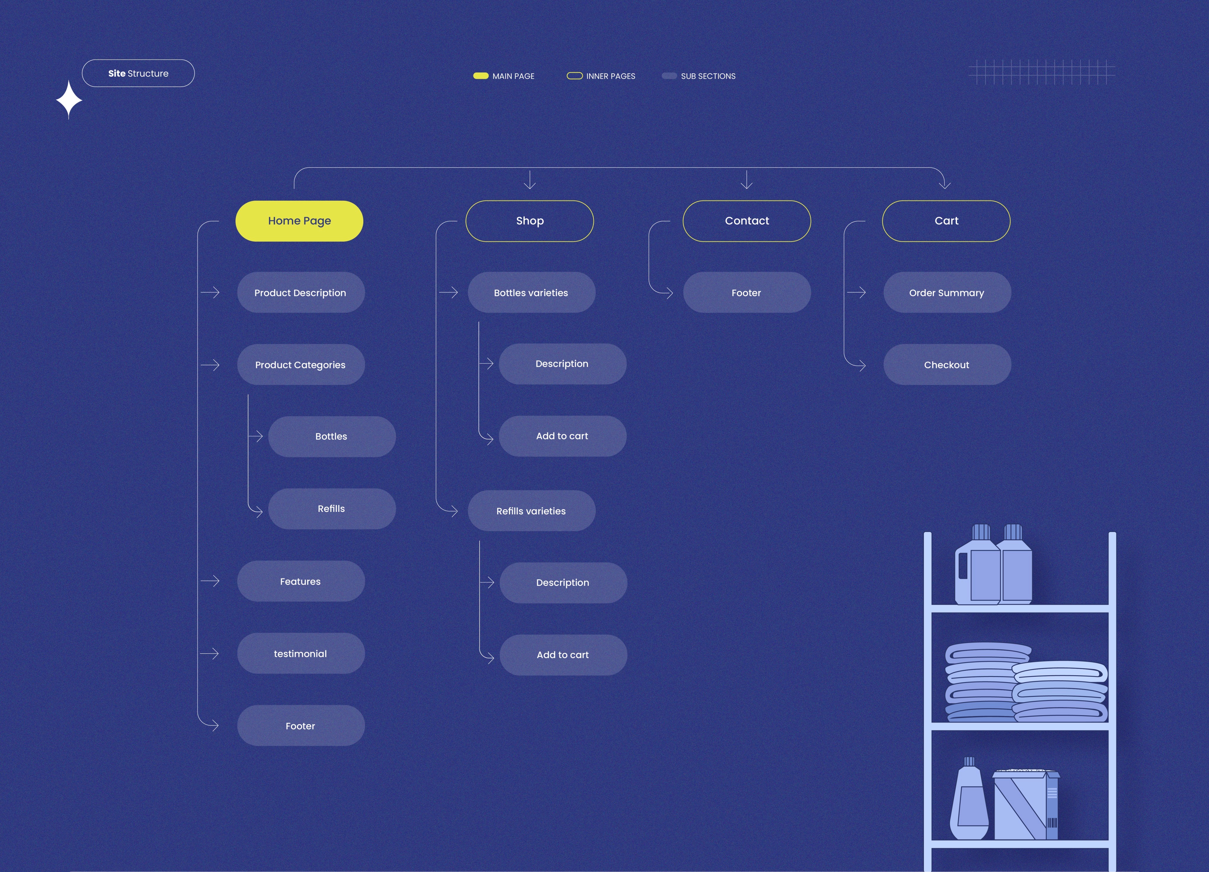
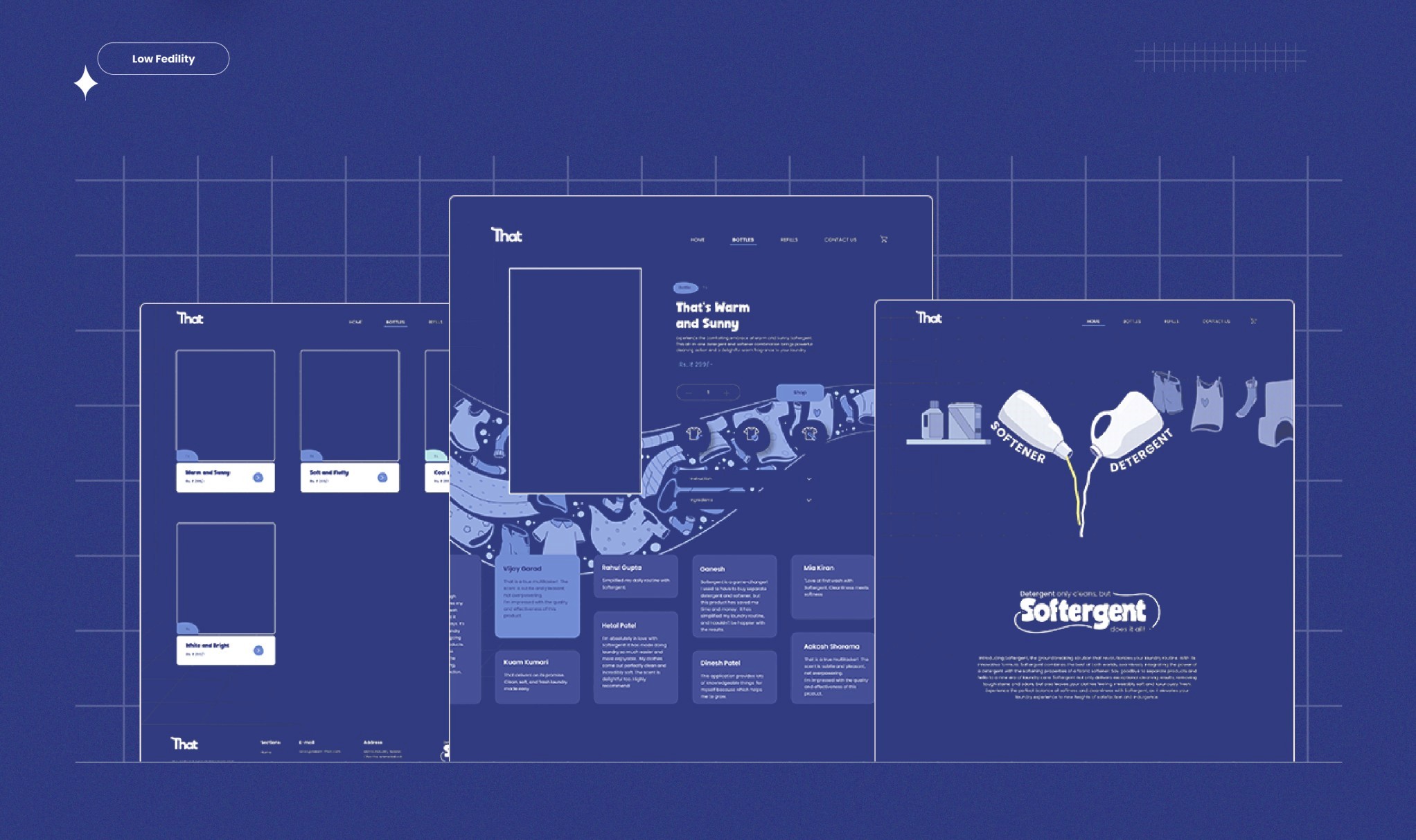
To bring the vision of THAT Softergent to life, we began by mapping out the core features and content that the website needed. We created wireframes to explore the overall structure and flow, ensuring each section had purpose and clearly reflected the brand’s personality. We collaborated with key stakeholders to finalize the sitemap, carefully planning how users would move through the site while highlighting product benefits and brand storytelling.
A lot of thought was put into the banner section—we brainstormed impactful ways to visually introduce the product, considering video content or dynamic graphics. Our aim was to create a visual that immediately communicates how the product works as both a detergent and a softener, in a fun and easily understandable way.
The overall goal was to build a visually rich and interactive experience that increases engagement, improves user retention, and encourages exploration. We also designed a custom icon style to support navigation and maintain a cohesive visual language throughout the site.
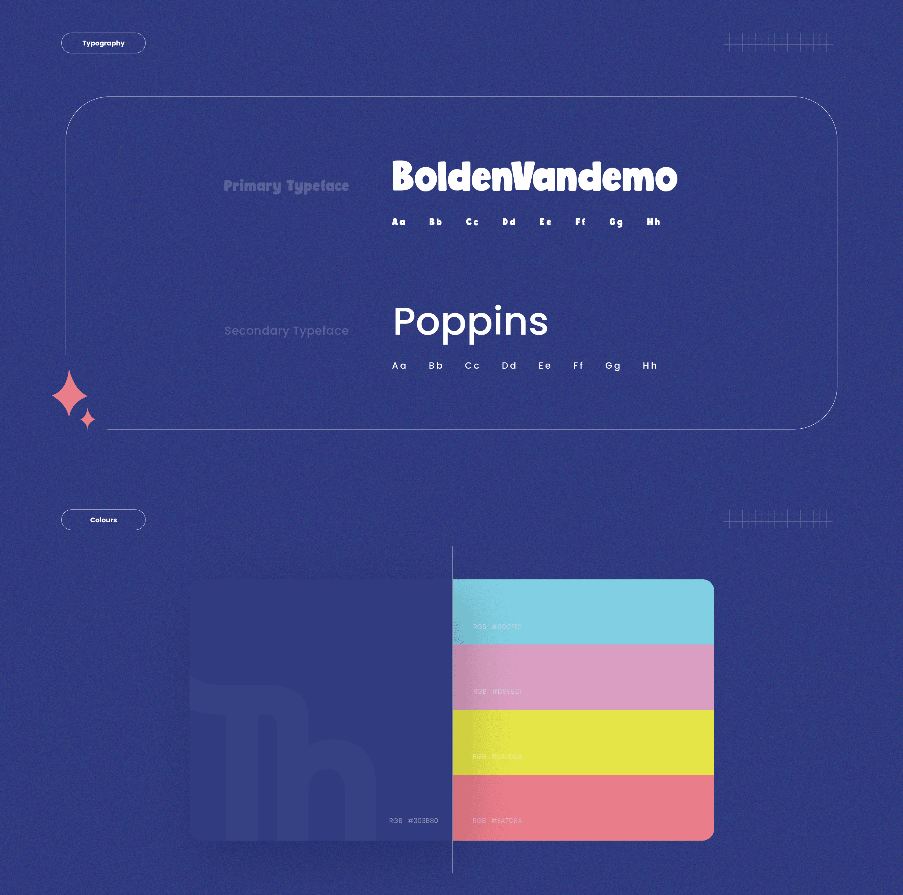
Our work for THAT Softergent went far beyond just the website. We also developed the complete branding and packaging design to bring the product’s bold and playful identity to life across every touchpoint. From the logo to the vibrant packaging visuals, every detail was crafted to reflect the brand’s fun, functional, and fresh personality.
Solution
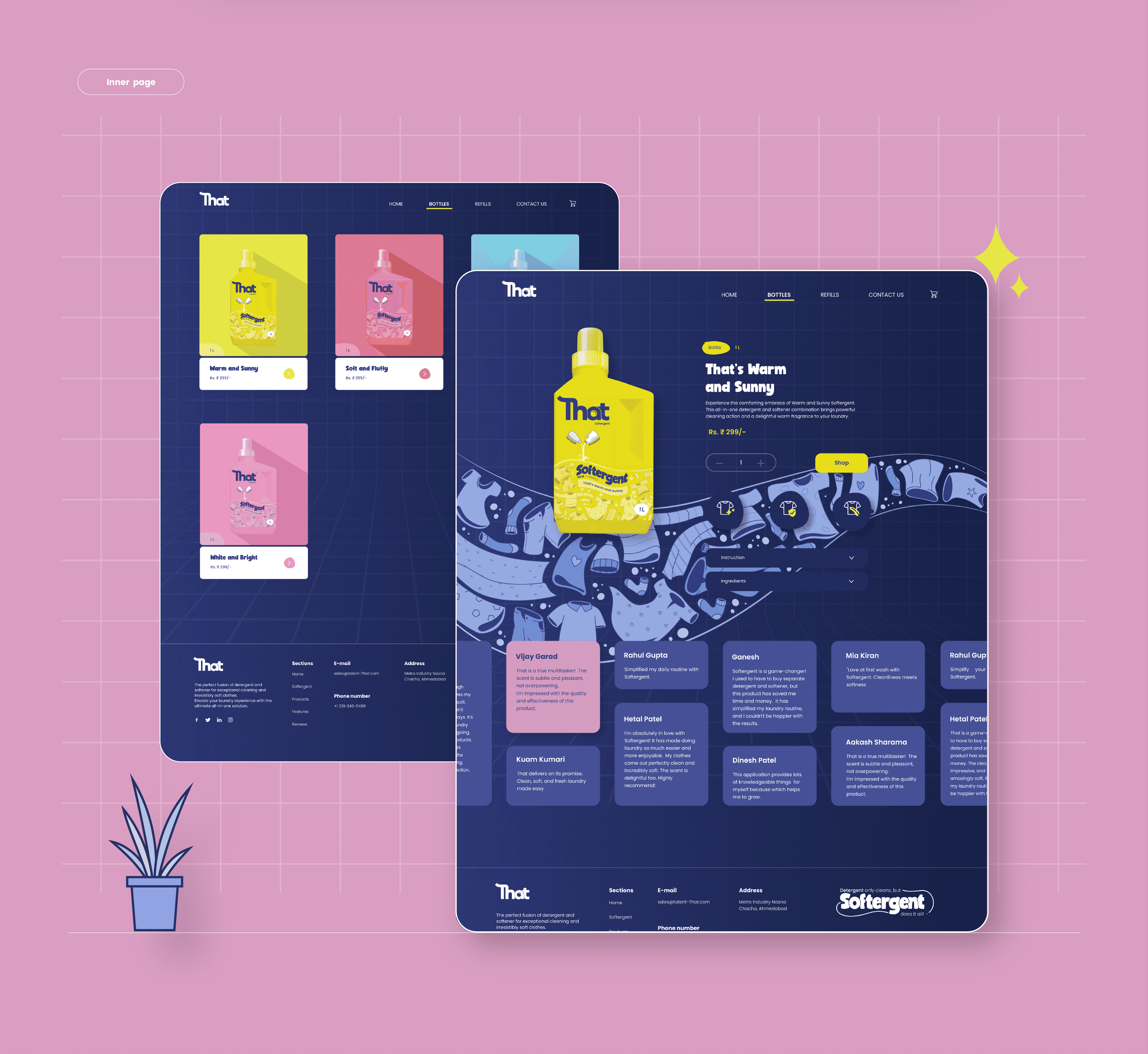
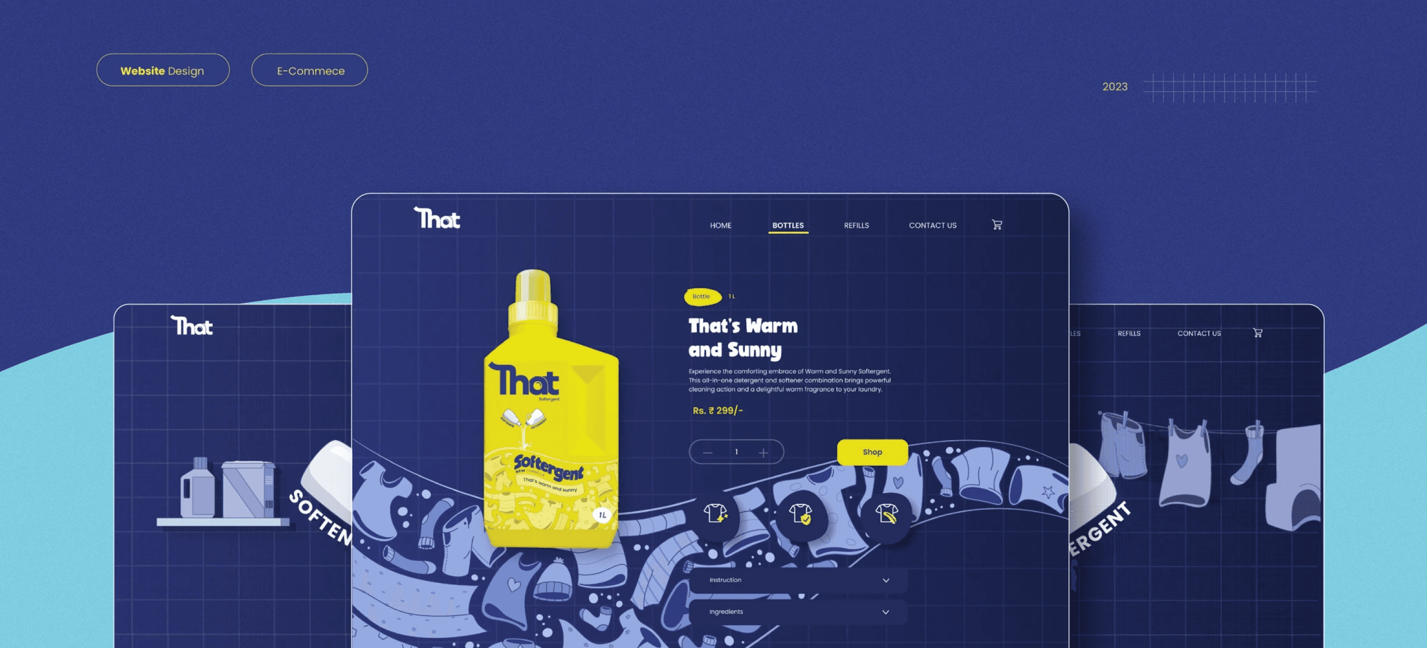
To keep the experience focused and effective, we decided on a minimal set of pages that delivered just the right amount of information without overwhelming the user. The product page was designed to highlight key details and pricing clearly, supporting quick understanding and decision-making.
After exploring multiple ideas, we chose to use a short motion video for the banner—an animated version of the packaging itself. This helped explain what the product is and how it works as both a detergent and a softener, all within a few seconds of landing on the site.
Throughout the website, the vibrant visual identity was maintained using playful illustrations, bold colors, and thoughtful storytelling. Each section was crafted to reflect the brand's personality—fun, fresh, and distinctly different—making the overall experience feel seamless and memorable.